Four Poems
Presented at the Glasgow School of Art, Double Take Group Exhibition, 2019.
Subsequently published by Textshop Experiments.
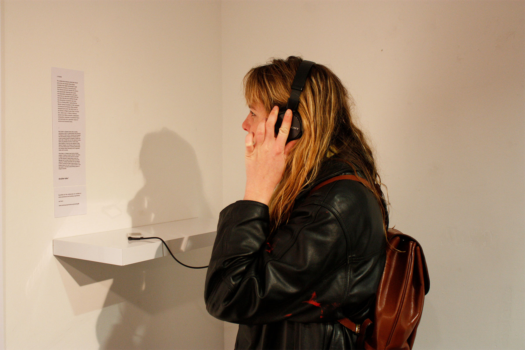
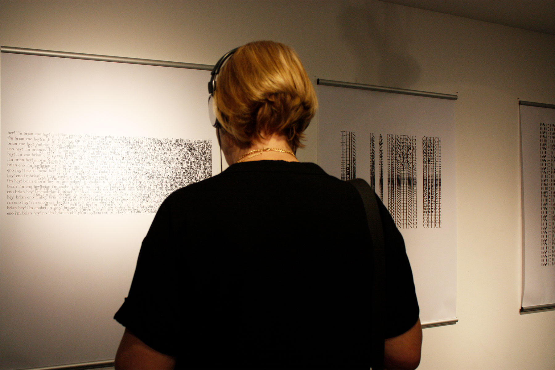
These three audio pieces, created in collaboration with the writer and visual artist Steve Rigley, consider how digital technologies might expand the horizons of concrete poetry from literacy and print towards the sensory and experiential. Exploring both sound and typography compositions, each piece references an associated creative field that has been liberated and redefined through the introduction of powerful new tools.
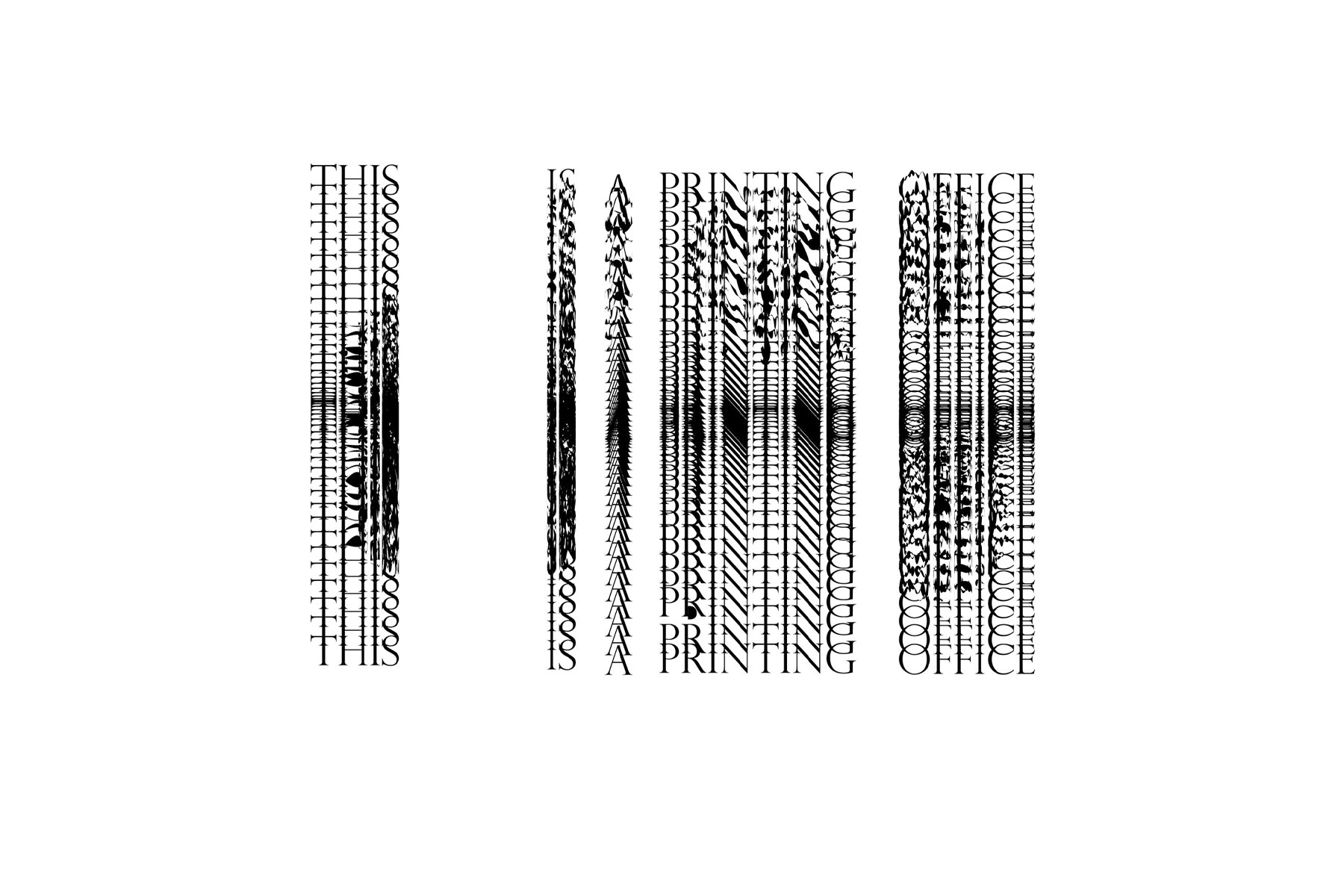
This is a Printing Office quotes Beatrice Warde’s famous broadside of 1932, designed to showcase the Perpetua titling capitals designed by Eric Gill. Penned by Warde, the broadside reminds those in the printing industry of their central role in maintaining a free society, concluding with the line “Friend you stand on sacred ground, this is a printing office.” Such concern for the protection of spatial and vocational hierarchies has crumbled in recent decades, with digital tools democratising design, manufacture and dissemination. Today’s printing offices now reside within laptops, pads and phones, with various and once highly skilled crafts and trades offered within an array of precision tools and drop-down menus.
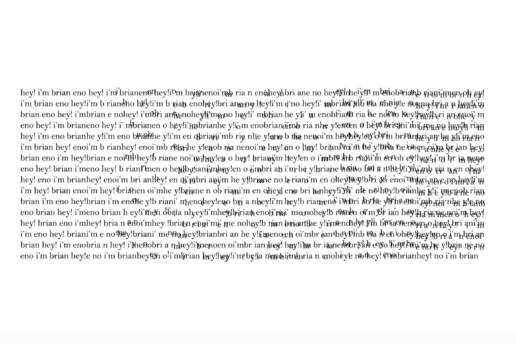
Similarly, the broad decks of the sound recording studio find an equivalent in the menus of advanced software programs such as Logic Pro. Hey Imbria neno is an iteration of Rigley’s poem Hey! I'm Brian Eno and features both a typographic composition and a corresponding audio response built by Parnell from individual word recordings.
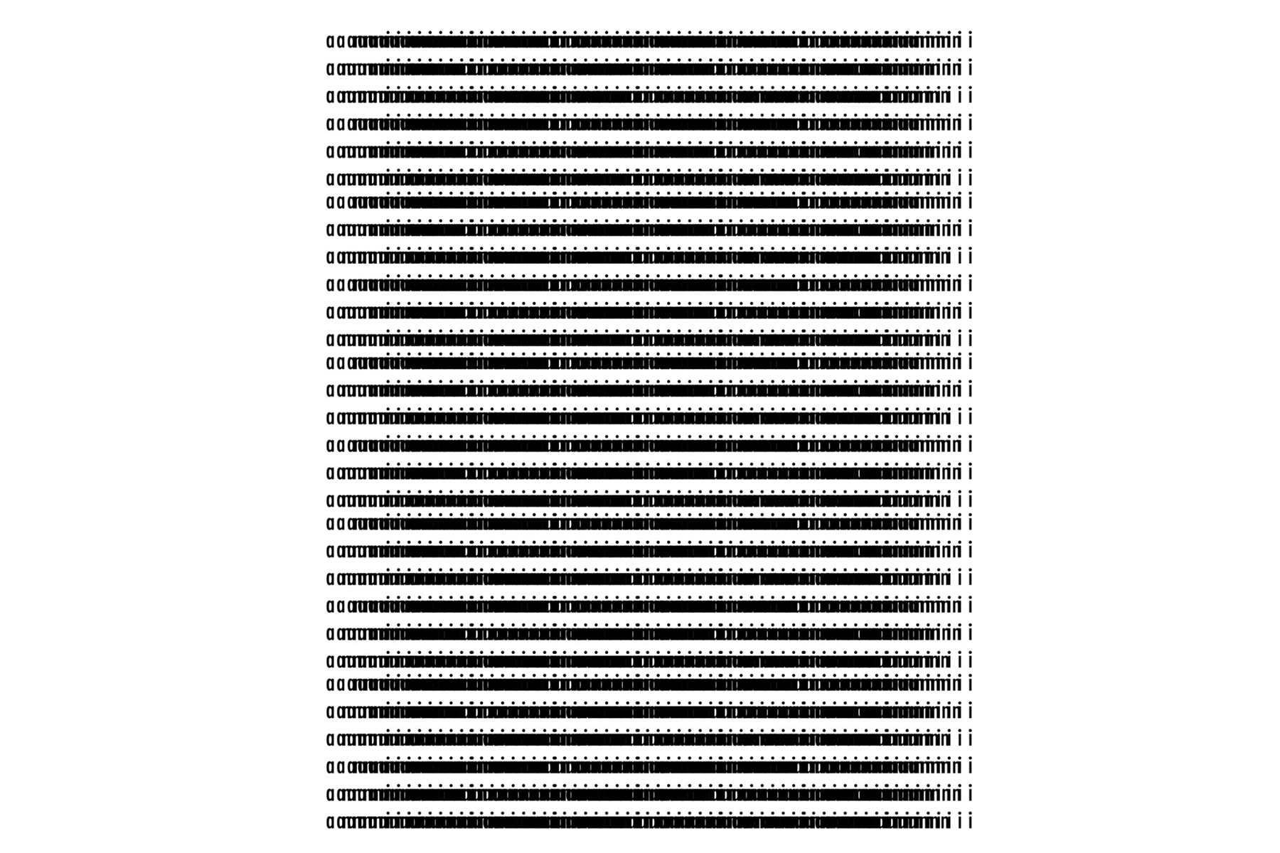
anni, a tribute to Bauhaus pioneer Anni Albers, presents a typographic composition composed of condensed Futura and abstracted into a geometric weave of vertical and horizontal forms. Influenced by abstract art and graphic design of the period, Albers was a keen advocate of new technologies in her work, weaving synthetic fibers, such as cellophane, into her compositions. Albers would, no doubt, revel in the opportunities afforded by digital technology, and the tools to explore the liminal spaces between domains such as graphic design and textiles.
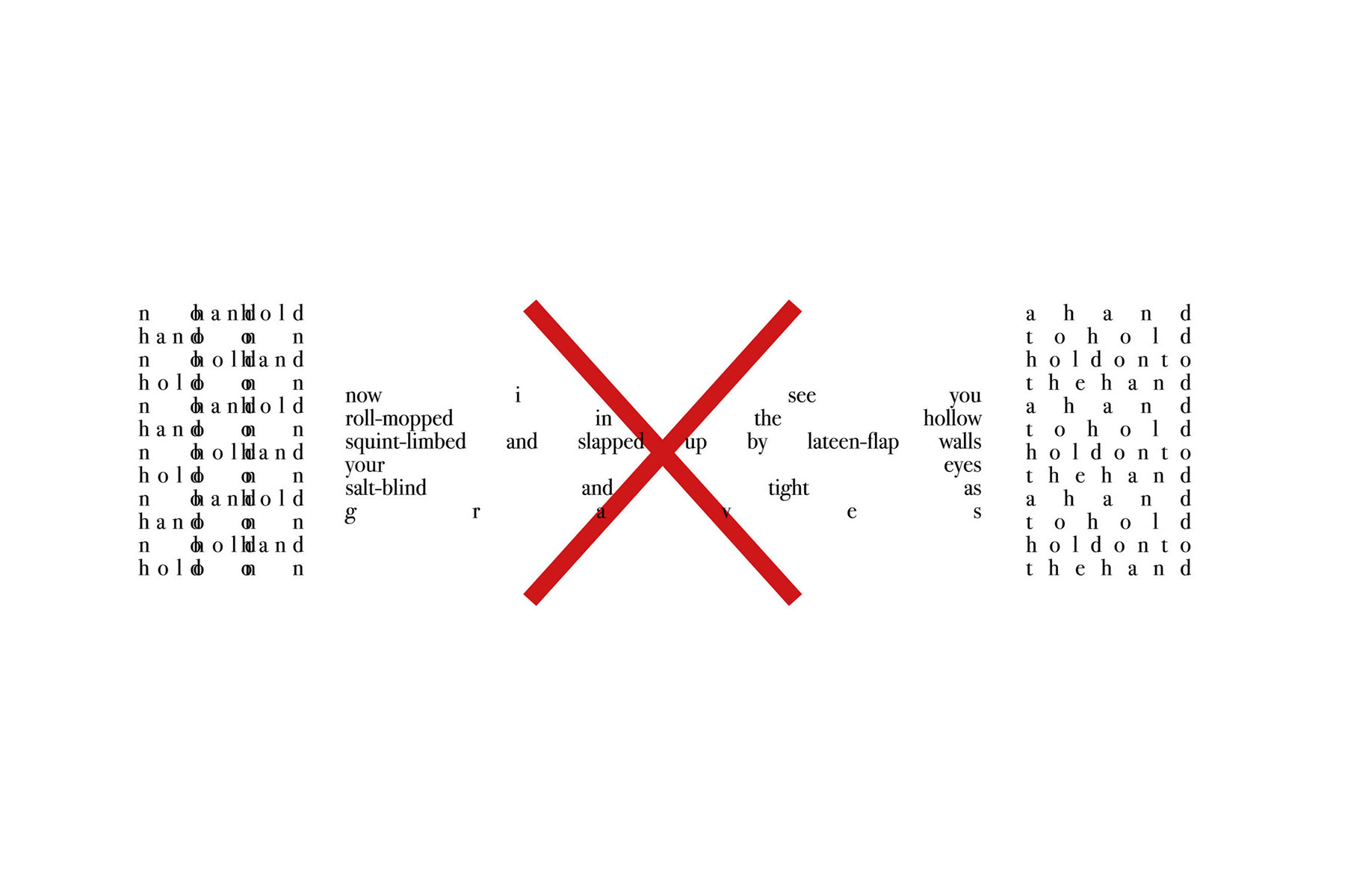
Finally, and partly inspired by a climbing accident in Tel Aviv, Rigley's poem Japho presents a blend of concrete and pattern poetry. The title references the ancient port from which Noah departed on his ill-fated journey, whilst the typographic structure infers both linear narrative and a period of contained reflection.
Audio: Max Parnell
Visual Content: Steven Rigley
The audio files alongside the poems can be accessed via Text Shop Experiments.